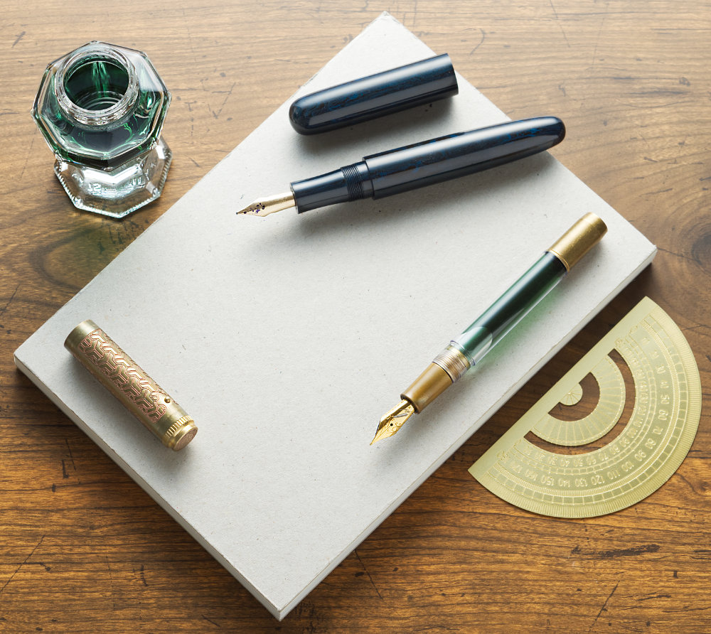
Yoseka's minimalist notebook makes ink pop

Yoseka Stationery is a stationery store in NY, founded in 2017 by a Taiwanese couple. Earlier this week, they sent one of their products, the Yoseka Notebook, for me to test.
For the last few days, I’ve been carrying and writing in this notebook. That also included bringing it to a pen meet where it encountered some of the wettest nibs around, such as music flex nibs by nib maniac @tokyostationpens.

Yoseka Notebook is an A5 notebook with 224 unlined pages, and thick, gray cardboard covers with an embossed Yoseka logo. It has naked binding, lays flat, and overall has an understated look to it. Tasteful minimalism.

The paper is called KBU 2, from Taiwanese brand Conifer, and is 85 gsm. I was not familiar with this paper, but Taiwan stationery expert @atsaichu says KBU paper is considered fountain pen friendly and sold at stores like TY Lee.

Personally, I prefer paper with a bit of texture. That subtle tactile feedback is both pleasant and helps my handwriting. Also, pens that are prone to hard starts on slippery paper tend to behave better. This Conifer KBU 2 paper has just the right amount of feedback for my taste: More than Life L and slightly less than Midori MD.

Ink looks just beautiful on this paper, possibly even on par with Graphilo. Shading is more pronounced than on most other paper I tried, text looks somehow smoother, and there’s not a hint of feathering. Even Sailor Kinmokusei sheens on it!

On the negative side, there is a bit of bleedthrough with broad and wet nibs, similar to Leuchtturm. With fine and medium nibs, you’re unlikely to notice any, but you probably don’t want to write on both sides with a music, flex, or fude nib.


Despite the bleedthrough, I’m positive. Mostly because of the lovely texture, but also the elegant, minimalist design and beautiful shading. This will be my ink testing notebook.
Disclaimer: I received this notebook free of charge.
#yoseka notebook #review #notebook #yoseka #conifer #kbu2